

The Mylands Archive Collection: Informed By The Past, Inspired By The Future
November 26th, 2021
Mylands, The House of Colour, is pleased to introduce The Archive Collection, launching Autumn 2021.
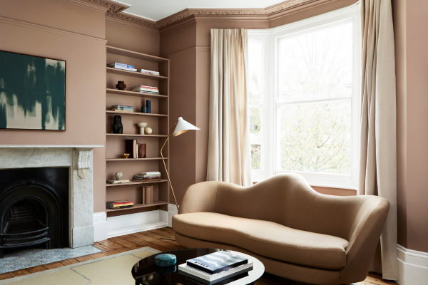
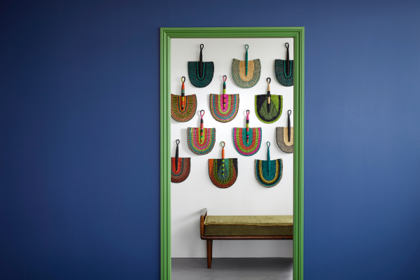
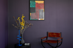
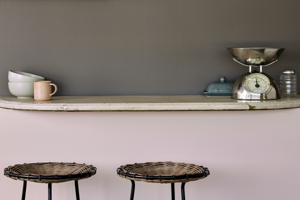
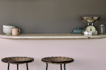
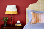
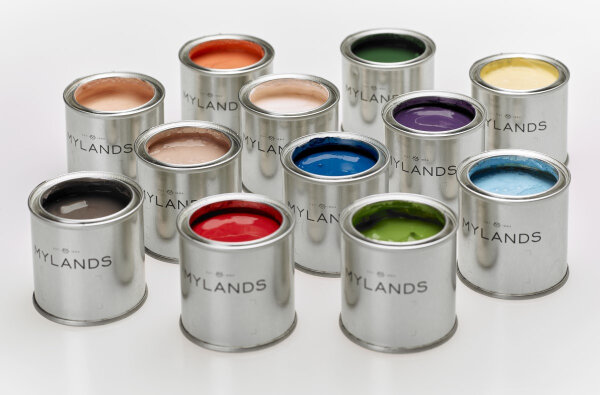
Inspired by its rich history, the collection is comprised of 12 new colours rooted in the past but with a timeless appeal for today’s interiors. The new colours range from soft pinks, honeyed yellows, rustic oranges and gentle blues through to bold reds and rich greens, all of which have been carefully curated to deliver a fresh new palette that uses rich tones and intensely pigmented formulations.

From Left to Right
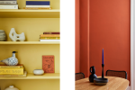
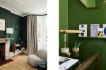
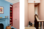
Beehive Place, Coral Orange, Pleasure Gardens Green, Sorrel Green, Enamel Blue and Peach Flesh Pink
Delving into its incredible archive of bespoke colours developed for clients over many decades, alongside shades derived from the British Colour Council, Mylands has carefully selected each shade for its individual character and tone. From easy neutrals to confident brights, these colours are as breathtaking as they are versatile.
The colours are made up of old favourites from the Mylands archive, with a handful of colours from its collection of ‘British Television Standards’, a palette which has been in operation since the 1950s providing paint for some of the UK’s best loved productions in Film, TV and Theatre. The British Colour Council, whose original books are in the Mylands archive, was an industry standards organisation during the 1930s-1950s.

They include indexes of named colours for use by horticulture, government, and academia. Mylands matched these hues up to the mid-1950s until the British Standard Colour Chart became the go-to for most paint companies. Some of these best-loved colours have now been reproduced in this collection, with Mylands holding the licence to recreate them today.
A new look for Mylands Drawing on its rich heritage as experts at paint and varnishes, Mylands is pleased to reveal a new and thoroughly modern visual identity for a contemporary world. The drive behind the new look was to introduce clarity and simplicity to the brand, reflecting its expertise, quality and longevity. A purist, industrial look has been achieved with the covetable metal tin, stripped back to its raw metal finish allowing the simplicity of the mark to take centre stage.
Historic imagery of the first Mylands store in South London in the late 19th century was delved into for creative inspiration. After unearthing an original ‘JM’ icon, standing for John Myland, who was the first in a line of five John Mylands to stand at the helm of the family-run business, the symbol was reintroduced to the brand. Using the ‘M’ for the new logotype, it was reimagined through a modern lens, and it serves a role as a mark of quality for the Mylands brand.
Britain’s oldest family-owned paint manufacturer and Royal Warrant holder, Mylands has been creating seductive colours that awaken the imagination since 1884, perfecting the art of making eco-friendly water based paint with unique recipes, superior ingredients, and an unwavering dedication to quality. A rarity in modern paint production, Mylands continues to carry out much of its colour creation by eye, believing that a digital colour match cannot compete with the craftsman’s touch.
Peach Flesh Pink™ No.268 This fresh peachy shade is both punchy but delicate and incredibly versatile, containing yellow oxide and bright red pigment.
Egerton place™ No.297 A deep, earthy mushroom pink of umber and red with a touch of black. This bespoke colour was originally created for an attractive period property on this sought-after West London square.
Sorrel Green™ No.207 Inspired by the perennial herb, bring elements of the outside world in with this vibrant botanical green. Containing bright yellow, umber, and a touch of white.
Rose Taupe™ No.292 With a vintage feel, a deep brownish grey containing bright yellow, red and black pigment. This warm shade, originally from the British Colour Council, is both a timeless neutral yet rich and atmospheric.
Empire Violet™ No.80 A regal, jewel-like dark purple of red, umber, and black. This statement hue from the British Colour Council creates both intimacy and drama in any room.
Beehive Place™ No.140 Combining umber, green and white to form a bright sunshine yellow. Named after the street of the original 1884 Mylands store. This colour is warm and muted yet bold enough to make a statement.
Coral Orange™ No.277 A colour reminiscent of underwater coral marine life. Bright red and yellow come together to form a vibrant and muddy orange shade full of optimism.
Red Post Hill™ No.68 Named after a South London road, this classic post box red contains a mix of six pigments: bright red, magenta, violet, black, yellow, and white.
Enamel Blue™ No.78 A richly pigmented light and bright blue. A combination of white, black, and violet form a striking and serene shade.
Proper Blue™ No.67 A bold and energetic deep cobalt blue of green, violet, and black. Evoking an ocean of endless depth whilst still appearing tranquil and still, it pairs beautifully with almost any colour scheme.
Pleasure Gardens Green™ No.214 A dark green containing red with a drop of violet to deepen the tone. Named after the leafy Vauxhall gardens on the south bank of the River Thames and just a stone’s throw from Mylands’ original store.