


Inspired by Morris – An Insight into the World of Interior Design
October 7th, 2021
View the Morris Wallpaper collection here.
Interior designer Naomi Scott-Dunne recently re-designed her apartment based in Putney, London. Built between 1904-1905, the Grade 2 listed Kenilworth building is made up of 150 apartments and has even been featured on the big and small screen! This is just one of the many facts Naomi uncovered when re-designing her new home, using research to fuel her creativity, “I am a very conceptual designer, so I always take in a building’s heritage, its provenance and stories surrounding the property.”
After researching several images as a starting point, she decided on the William Morris tapestry ‘The Woodpecker’ which depicts a tall fruit tree surrounded by swirling foliage, which Naomi felt captured the organic flow of the river and complemented the hues of the stained glass. She wanted all the rooms to have a harmonious feel, so every space in the apartment needed to be true to the original image.
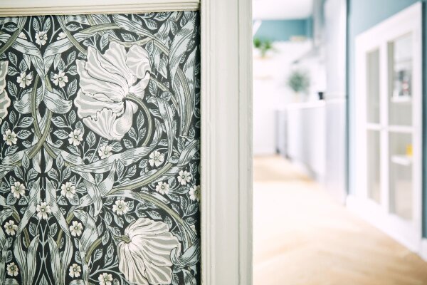
The Hallway
Naomi recognised this space as 'the pulse of the apartment' as all rooms run off it which is why the iconic Morris design was selected.


Morris & Co Wallpaper was selected for the hallway which is exclusive to Brewers and Wallpaper Direct. Naomi explains why she chose this design in particular, “the luxurious textural paper possesses the same ebb and flow of the River outside embodied in the intricate floral trellis and organic forms, whilst also possessing a strong symmetrical formation of the leaves, which Morris & Co incorporated into the design of his Pimpernel paper. Created in around 1876, the wallpaper exemplifies how Morris’ interest for Japanese design led to the simplification of lines and colours. Morris even used Pimpernel to decorate his own dining room at Kelmscott House in London. It was important for me that the hallway was the pulse of the apartment – it is both long and wide, with high ceilings and all rooms run off it.”
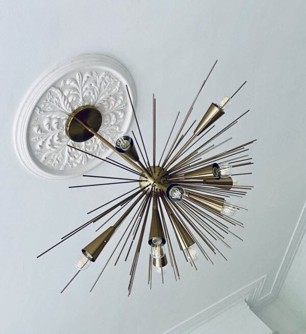
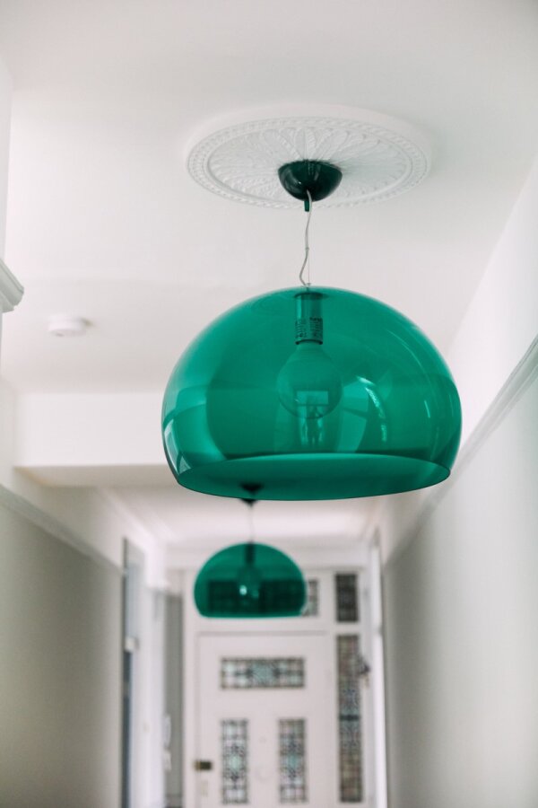
Naomi also used hand crafted ceiling roses, which are sympathetic to the buildings’ history and synonymous with her lighting choices, another key component of her design. Naomi also describes her colour selection, “Selecting paint colours was such fun: I wanted to extract from the Morris & Co Pimpernel wallpaper. For the Hallway above the dado rail and wallpaper, I opted for Farrow & Ball’s Light Blue 22, a delicious hue whereby its bluey-green characteristics changes throughout the day and looks divine when the two pools of light fall from the light pendants. Light Blue creates a peaceful and calming effect, and its silvery hints highlight the metallic touches in the Pimpernel.”
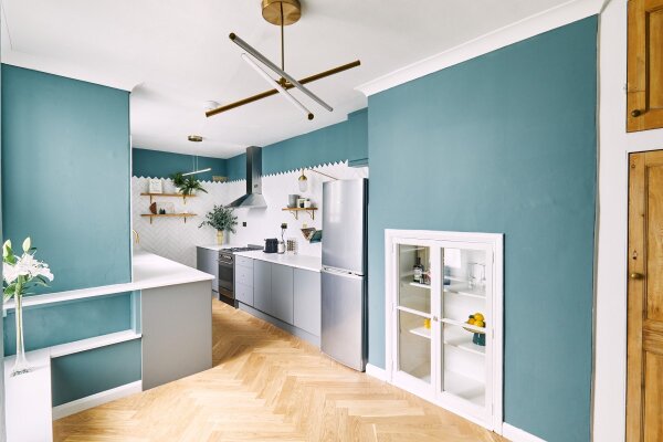
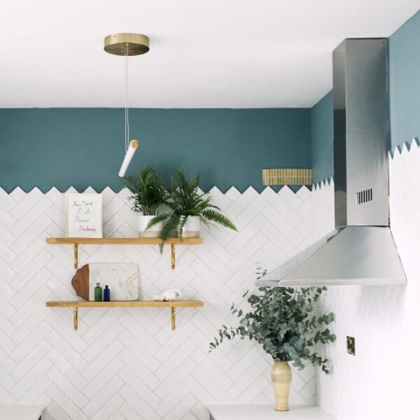
The Kitchen
Mylands Burlington Arcade was used alongside the Herringbone theme carried from the flooring, to the tiling and organic sisal to encourage cohesiveness in the space.


“For the living room I opted for Farrow & Ball’s Elephant’s Breath – a modern classic which pairs beautifully with the crispness of the billowing white linen curtains/drapes and is a super neutral canvas to build upon and truly personalize a living space.”
“For each of the ceilings and space above the picture rails throughout the apartment, I selected the bright and airy Loft White by Little Green, which lifted every colour and gave the illusion of even higher ceilings than they are. With the exception of the dining room and kitchen, all woodwork was painted in the same hue as the walls, creating a flawless contemporary look, at the same time respecting the integrity of the space.”
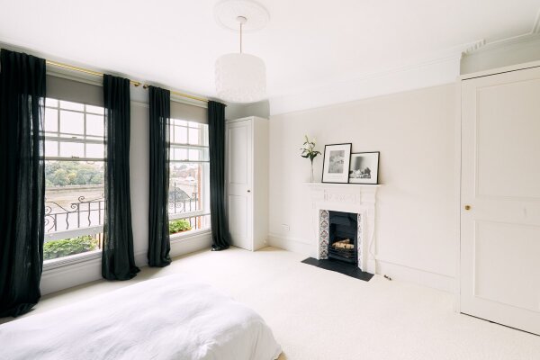
The Master Bedroom
Blackout blinds were used as an essential to any bedroom, but dressed with linen curtains in a dirty moss hue.


“For the master bedroom – incidentally both bedrooms are the same square footage – I chose Farrow & Ball’s beautifully understated neutral Skimming Stone, which created a peaceful oasis. The second bedroom is flooded with light and the sizeable sash windows allow the breeze the blow in throughout the day. I selected Morris & Co Strawberry Thief Linen curtains to echo the wallpaper in the hall and they also precisely matched the walls, skirting and millwork in Little Greene’s French Grey.”
“For the dining room and area above the crowned tiles in the kitchen, Mylands Burlington Arcade was an easy choice for me, again extracted from the Morris & Co Pimpernel wallpaper in the hall, but also the shade of bluey-green teal was sophisticated, contemporary and fresh.”

The Guest Bedroom
Morris & Co Strawberry Thief curtains were used to echo the wallpaper used in the hallway.


Naomi also said "The Putney Team are phenomenal - Tony, Lisa and team in assisting with all my paint and related queries. A super service was provided both in person and over the phone."

")
")
")