

Embrace nostalgic neutrals and simple comforts with Johnstone’s Trade Voice of Colour trend colours
September 24th, 2020
In an era where normal is no longer and mental and physical wellbeing have become more important than ever, people are craving simple comforts and slowed down lifestyle. They are looking for ways to escape everyday life and try to create their own personal retreat. To help express creativity, Johnstone’s Trade Voice of Colour presents the trend colours 2021, selected by PPG’s global colour experts from around the world.
“We want to empower everyone to take a more personal view to colour and to confidently include colours in their projects and homes,” Donna Taylor, PPG commercial colour expert explains. “With the help of our Trend Colours 2021 and the 60-30-10 design rule we guide them through the world of colour and by doing so we hope to make the process of choosing colours easier and help them to let creativity flourish.”
Inspired by the changing and diverse lifestyles Johnstone’s Trade Voice of Colour Trend Colours 2021 are focused around wellbeing and finding balance. “With the world sheltering-in-place for the better half of the year, we have begun to crave human connection and are embracing simple activities, including walking, hiking, baking, and gardening,” says Donna Taylor. “These organic but hopeful colours, that can be particularly found in our Be Well trend palette, represent what we have been longing for after decades of over-stimulation and over-consumption – simplicity and restfulness.”
The increasing need for comfort, human connection and mindfulness were reoccurring themes at PPG’s Global Colour Workshop. This annual event brings together more than 50 PPG global colour stylists from the automotive, consumer electronics, aerospace and architectural paint and stain industries. Over the course of several days, the stylists analyse the runway, lifestyles, demographics, geographies, global events and cross-cultural societal inspirations to determine what colours will resonate and represent the PPG global trend story.
Brown the new grey
Over the recent years, grey tones have been dominating the interior design world as the perfect neutral colour. However, we are longing for more warmth and are looking for that connection to earth, we are moving away from the cooler grey tones to the warmer browns. As Donna explains: “When the world experiences events that cause unrest, anxiety and grief, we tend to naturally gravitate toward comforting colours that allow us to create a personal retreat from the world. These comfort colours are similar to comfort foods – both offering a certain sense of familiarity and normalcy when facing the unknown.”
Transcend (PPG1079-4) is an example of such a colour, it is warm hue with a soft red undertone, making the colour even more complex than a flat beige. The versatile colour can be used as main colour for large open concepts, but also works beautifully with other neutrals and nuanced pastels or even as a backdrop for more vibrant colours to pop. It is therefore that we like to call this colour our elevated neutral and it can be found in all three trend palettes.
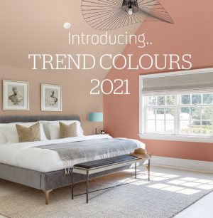
Be Well – Creating comfort
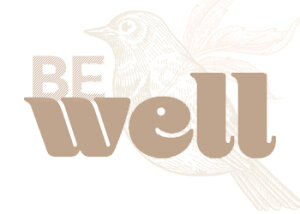
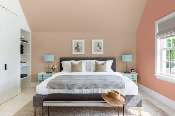
At the heart of our trend story the Be Well palette can be found. This palette is intended for those who want to fully embrace mindfulness and intention, showcasing natural hues that are restorative and optimistic. A highlighted trio of three colours, Transcend (PPG1079-4), Big Cypress (PPG1062-5) and Misty Aqua (PPG1147-3), celebrates the beauty of all kinds and relates to those who want to prioritise wellness in mind, body and spirit.
Transcend, is a mid-tone oatmeal coloured hue that draws on earthy influences and nostalgia. This cozy neutral emulates the feeling of a warm latte on a cool morning, or warm sand on a sunny summer day. Big Cypress, a shaded ginger with persimmon undertones, is the equivalent of a big, comforting hug for your home. Misty Aqua, a watercolour cerulean blue, provides an unexpected pairing of freshness against the other warm, earthy tones.
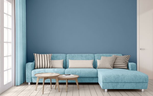
What says calm more than a beautiful deep, neutral, orchid blue like Canyon Blue (PPG1155-6). Paired with another neutral Stone Quarry (PPG1015-2), a sandy white with brick undertone and Midsummers Dream (PPG1151-3) a soft, muted, breezy aqua-blue.
Be True – Anchoring reality

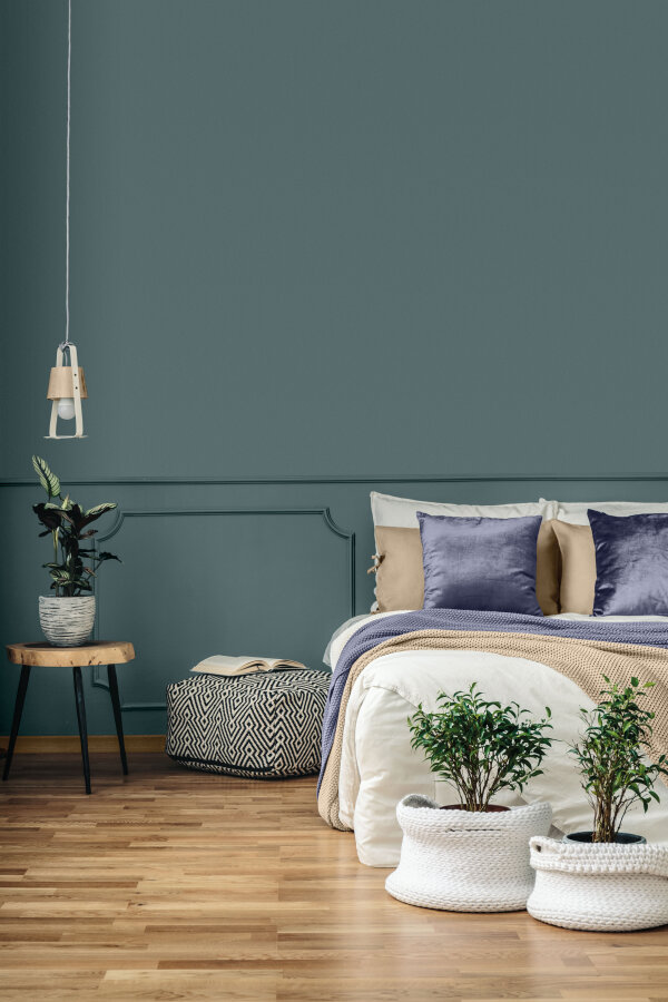
This palette celebrates authenticity and connection by imitating an artisan’s touch and renewing traditional know-how by layering vintage-inspired colours and recycled and contemporary touches. The palette is a mixture of organic and heritage influences with warm, earthy tones combined with rich, jewel box hues. Enchanting Eggplant (PPG13-07), a rich maroon with chocolate undertones, grounds the palette alongside Boulder Lichen (PPG1127-4), a glass bottle green, and Transcend.
Dusk Puddle (1145-6), Best Beige (PPG1085-4) and Wild Hyacinth (PPG 1171-7) combine both sides of the Be True colour palette. Both heritage influences in that deep, jade aqua-green Dusk Puddle and nature tones are incorporated in this 60-30-10 combination.
Be Wild – Activating optimism
The colours in trend palette Be Wild breathes optimism and approach interior design with humor and courage. It encourages you to be daring with paint. The design elements are playful, expressing a bold and creative individuality. This palette exhibits confidence and a positive attitude by mixing energetic colours and grounding neutrals in an inspiring way.
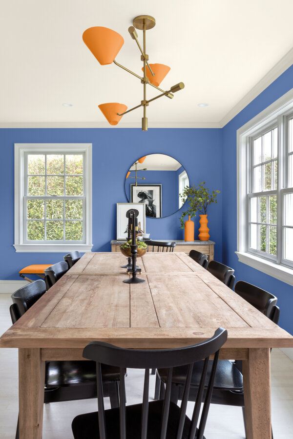
The Be Wild combinations are for the more daring customer. The deep, muted blue-purple with wisteria undertone Blue Odyssey (PPG1166-6) is used as the main colour in this dining room. With a Pacific Pearl (PPG1011-1) ceiling and Tangerine Jelly (PPG17-22) this room is designed to stand out.
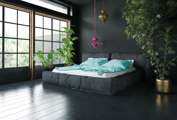
Whitby Jet (PPG1001-7), a dark, warm, bat black undertone serves as the perfect canvas to make colours like Raspberry Cocktail (PPG17-11) and Aqua Fiesta (PPG1147-4) stand out. A daring combination in the bedroom.