

Dulux Denim Drift - the colour for 2017

September 9th, 2016
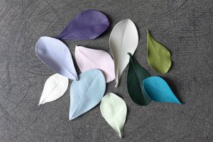
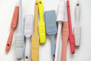
For the 14th consecutive year, AkzoNobel have released their colour trends for the year ahead. Colour Futures 17 titled Life in a new Light showcases their colour of the year, Denim Drift, in 4 striking and adaptive palettes.
Inspire your customers with these colours palettes that have been selected by the Dulux colour experts to reflect the “world’s movement towards an appreciation for the everyday, yet essential, elements of life”.
Denim Drift is a timeless blue, reflecting many elements of our lives depending on the light, colours it is combined with and where it is used. The four palettes show how versatile Denim Drift is, New Romanticism, Shared Individualism, The Working Home and Considered Luxury.
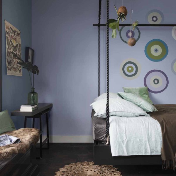
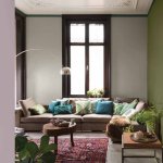
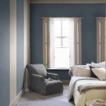
New Romanticism embraces our connection to nature and brings the outdoors in.
Dense greens and soft lilac tones create a palette with a modern yet relaxed and nurturing vibe.
Perfect for creating rooms with a serious yet tranquil style.
Style advice - team with cane, wicker, bamboo and crochet accessories and furniture.
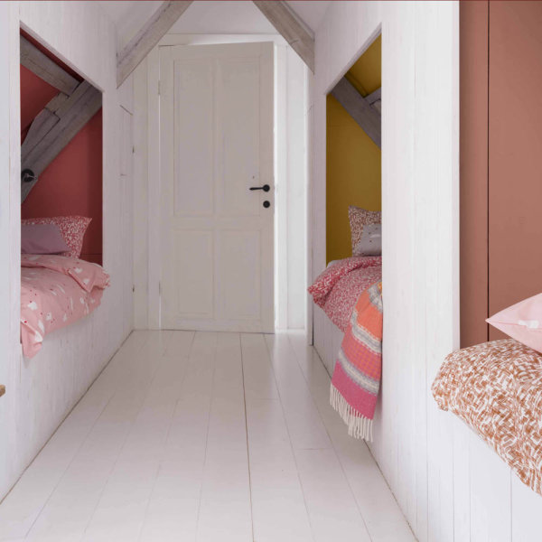
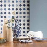
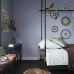
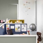
Shared Individualism recognises our desire for communities – whether they are friends, family or developed on or offline.
The palette created is striking with bright, bold, youthful colours.
Fizzy yellows and corals work in harmony with the sophisticated, mature tones of powder blues.
Style advice - use to inject identity and zoning to open plan spaces.
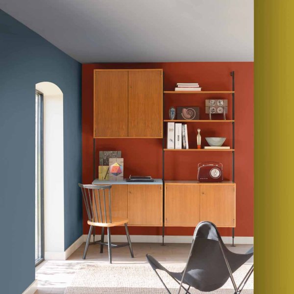
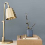
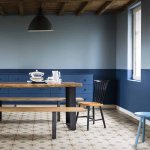
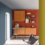
The Working Home reflects the increased merging of our homes and working environments as the digital movement enables remote offices.
This palette is clever; it is energising yet soothing at the same time achieving a masculine, cool yet welcoming collection of colours suitable for multi-functional spaces.
Deep, robust colours are used in this palette including mustard, rusty red and greys, all working beautifully with Denim Drift.
Style advice - complement this palette with chunky bold furniture and geometric patterns
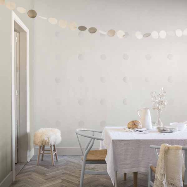
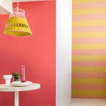
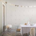
Considered Luxury captures the new found appreciation for experiences and life enrichment that isn’t achieved through possessions.
Minimalistic and chic, this palette embodies simplicity; a contrast to the other palettes.
The soft, understated tones create a palette that will suit any interior.
Style advice - layer these colours and use different textures to create a luxurious space.
Use these colour palettes to help your customers create spaces suited to their personality and lifestyle. Pop into your local Brewers store for colour cards to help your customers decide on the best colour for their homes.
Keep up to date with the latest trends and news from the industry by following us on Facebook, Twitter and now Instagram too!

Denim Drift
Explore the Colour Futures 2017 paint colour palettes prepared by Dulux. Photography courtesy of Dulux.
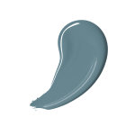

"Blue has been, and will continue to be, a constant in every aspect of our lives"
Timeline
Dulux Colour Futures from the past
- 2016
- CF16: Ochre Gold
- 2015
- CF15: Copper Blush
- 2014
- CF14: Teal
- 2013
- CF13: Indigo
- 2012
- CF12: Firecracker 4
")

")