

Dulux unveils 2018 colour of the year and trend predictions
October 11th, 2017
Celebrating a landmark 15 years, ColourFutures has been created by AkzoNobel’s (the people to bring you Dulux) Global Aesthetic Center to provide ideas, inspiration and insight for interior and design professionals, as well as home owners.
Every year they bring together a group of international experts and trend watchers from various disciplines of design; architecture, textiles, product design, graphics and research. The group discuss what they think will be the major developments in trends in the coming years based on global social and design trends.

Using these insights and a wealth of colour and design knowledge, Dulux has forecast the colour palettes that best reflect the way we want to live as we move into 2018 and is titled A Welcome Home.
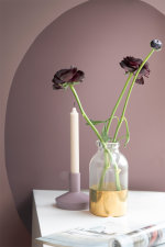
‘Heart Wood’ a warm neutral, with a hint of heather has been revealed as Dulux’s 2018 Colour of the Year, as Brits yearn to transform their homes into true sanctuaries.
The mood of the moment; translating this into trends
For 2018, that mood is felt to be one of unpredictability and uncertainty. As life gets faster, now is the time to choose to press pause. Our home needs to be a place where we can turn down the noise and be our sanctuary, a space where we can all look forward to being… A Welcome Home.
The colour for 2018 is inspired by the beautifully warm wooden materials we see being used in all kinds of interior decorating and architecture. A variety of woods are growing in popularity, but we see a tendency towards warmer, light and dark shades of red, alongside violet and pinkish woods. The warmth of wood reflects the comfort that we need in these uncertain times – this material is an essential element for creating the welcoming environments we desire.
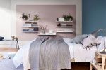
The Heart Wood Home
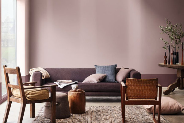
The colour of the year palette allows you to instantly feel at ease, centred around the comforting natural quality of Heart Wood. This trend reflects the importance of cosy wooden tones and since blue remains so fundamental, the colour collection flows beautifully from this year into next. The nourishing warmth of wood and tactile comfort of leather add to this sense of harmony. There is no need for excess – the ‘Heart Wood’ home has everything needed to create real balance.
The versatility of the palette gives consumers the freedom to balance softer shades such as cocoa with the deeper, bolder tones of ink blue and purple. Combining these shades in such a way creates a calming backdrop – effectively transforming any space into an environment of comfort and restfulness.
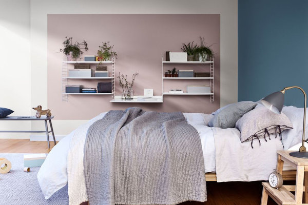
The Inviting Home
When it comes to the ‘Inviting Home’ trend, comfort and convenience reign supreme. It can be your den to snuggle up in, your nest to grow in and your safe haven to create memories and reflect on old ones. It has an effortless style where everything has a purpose from giant sofas to welcome the whole family to dining tables that gather people to enjoy each other’s company.
The Inviting Home colour collection has an easy-going style, bringing together softer pastels framed by graphic borders of coal and dark blue. Perfect for those who seek to bond with the people that matter to them most, the palette’s cool shades of blue reflect the nation’s favourite hue and encourage a clear-headed approach to life, while relaxed neutrals and sea-green support the need for connection.
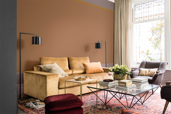
The Comforting Home
This trend is your retreat to shut out the noise, your haven to shelter in and your sanctuary to find balance. Relaxed, grown-up luxury is the perfect way to encapsulate the ‘Comforting Home’, with its heritage hints, warm-tone woods and use of natural materials. Rich, welcoming interiors with generously layered textures that offer you a restorative embrace and are filled with colours that enhance architectural features of the home.
The Comforting Home embraces warm woods, leather, silk and velvet to create a truly tactile space that you want to immerse yourself in. The palette itself encourages cocooning and re-setting by combining warm earthy tones to bring a sense of comfort, while clay and blush pink help calm the mind and soothe the senses.
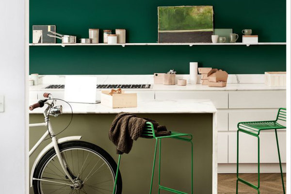
The Playful Home
As the name suggests, the Playful Home brings a sense of possibility and energy to your home. It can be your hub to recharge in, your space to create and dream in. Above all it’s about creating a place for drawing inspiration whether from favourite musicians, authors to artists – somewhere to welcome like-minded friends. There is a feeling of real vitality and adventure with pops of colour to create focal points and foliage all around. The space may be small, but the design is clever and resourceful with colour especially used to create different zones in tighter spaces.
With the Playful Home palette you can create a room that is invigorating and full of life. Inspired by nature, rich and yellow-toned greens work seamlessly alongside golden shades to spark the senses and encourage a creative approach to life.

Reflecting on the ColourFutures colours and trends for 2018, Rebecca Williamson, Dulux Senior Colour and Design Expert, added:
“Dulux’s colour of the year for 2018, Heart Wood, is incredibly versatile, and connects beautifully with the accompanying trend palettes for the year ahead. Providing the comfort and reassurance we’re all seeking, it’s the perfect antidote to the mood of the moment – channelling a real sense of calm and warmth during such times of uncertainty. We can’t wait to see homes across the globe transformed into true sanctuaries.”
Dulux Colour of the Year 2018
A Welcome Home - creating your own sanctuary