


How to Help your Customer Pick the Right Paint Colour

September 16th, 2022
Choosing a colour scheme is very much down to individual taste. Most people have an idea of what they would like but don’t know how to achieve it. Learn how to give some great paint colour advice with our guide below!
Choosing Paint Colour Top Tips:
• It may seem obvious but be sure to paint samples vertically. Some paint colours can look misleadingly pale when painted horizontally.
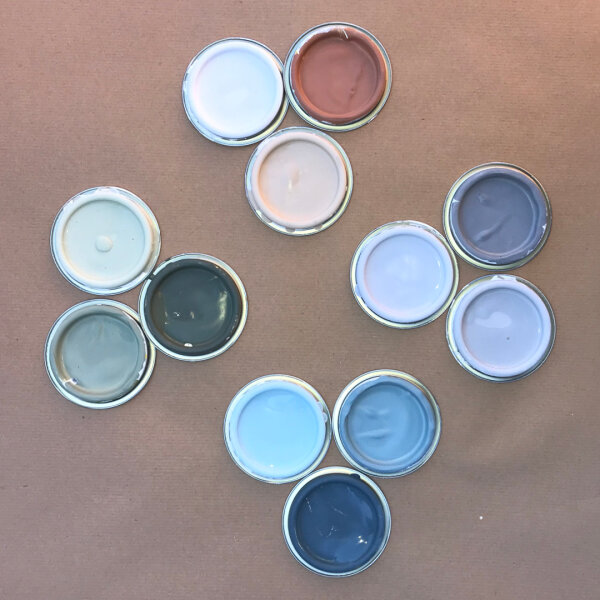
• Brush out sample colours onto squares of lining paper to stick to the wall. Your customers will be able to see the colour in the room and appreciate the impact the environment can have on colour.
• Take note of the direction the room is facing. For south/southwest facing rooms, suggest a cooler colour. For north/northeast facing rooms, advise warmer colours.
• Other forms of lighting can have a real impact on paint colour. Read our guide on how light can affect paint colour here.
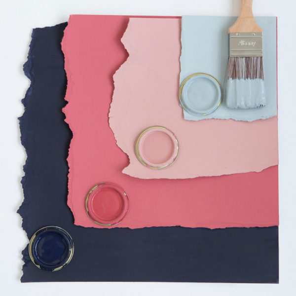
• Suggest using 3 or less hues which are strong, ‘pure’ colours.
• Take note of the existing colours within the space. If your customer isn’t planning on replacing flooring, soft furnishings or furniture, the choice of paint colours will need to work with these existing elements within the room.

The Colour Wheel Explained:
The colour wheel is a useful tool to
help you and your customer see how colours work with each other. For example, the
colour wheel has a warm and a cool side.

Advancing Colours
Half the spectrum is of warm colours (red, orange, yellow, pink, apricot, peach, terracotta, gold, warm browns, tans, plums, warm purples and lilacs).
These shades are often called ‘advancing’ colours because they seem to come towards you and in the process make a room appear smaller. As such they are ideal for highlighting a special feature or to achieve a warm, cosy environment.
Receding Colours
On the opposite side of the wheel are cool or ‘receding’ colours, (blue, green, jade, turquoise, mint, yellow-green, greeny-gold, blue lilacs and cool purples). They seem to be retreating from you, in the process making the room appear larger.
Using too much of one side over the other can have a negative impact on the space, so making good use of neutral colours is a safe option. Colours such as black, white, greys and beige are great for making a room feel balanced. Using colour accents in interior accessories is a great way to introduce small doses of colour which will lift the neutral colour scheme and add points of interest.
Colour Schemes:
If your customer wants to make a statement that is completely on trend, they can create a colour scheme of their very own. To find out more about how different colours work with each other, here is our handy guide on how to choose a colour scheme using a colour wheel.
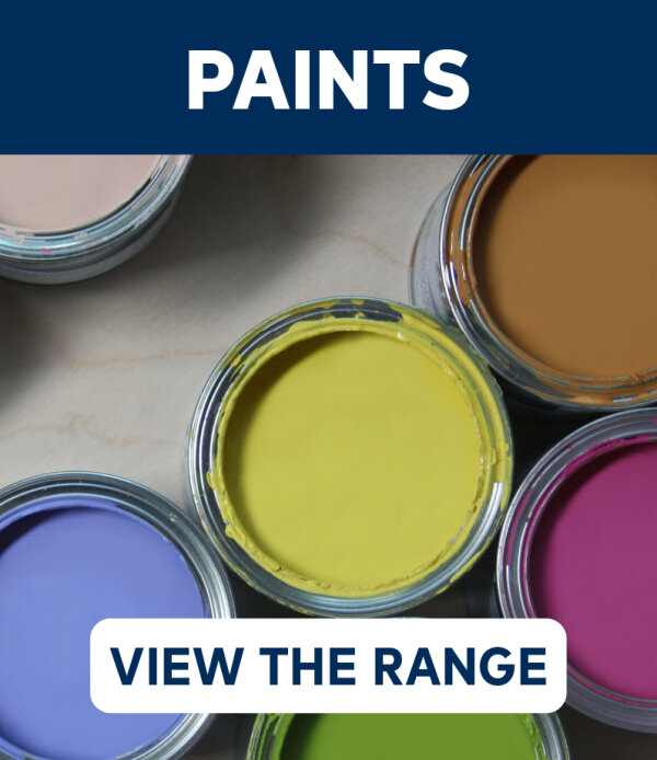
With thousands of colours available at Brewers, pick up some free colour cards from the finest paint brands to help you help your customer.


Colour cards and sample pots are always available at your local Brewers Decorator Centre – to find your nearest store, click here >>